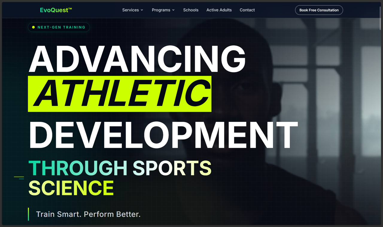
A visual identity built for action.
We pushed the brand toward high-energy contrast, strong product framing, and a landing flow that makes the offer feel tangible rather than abstract.
- Logo and visual system
- Offer hierarchy
- Hero and product framing

Evo Quest needed more than a clean website. We shaped the brand, UI, web experience, and funnel so the product felt active, premium, and easy to understand from the first scroll.

Interact with the live Evo Quest website in this browser preview.
Evo Quest's visual system uses movement cues, warm energy, and staged decisions so the site feels active before a visitor books.
We pushed the brand toward high-energy contrast, strong product framing, and a landing flow that makes the offer feel tangible rather than abstract.
The interface moves from brand promise to proof, benefits, and conversion intent without relying on a generic SaaS layout.
A fitness brand and Astro website shaped around a sharper offer, richer UI, and conversion-focused funnel path.

Each layer was chosen around ownership: the public experience, the delivery constraint, and the systems that keep the build running without rented-tool drag.
Primary Astro layer for the build.
Project-specific delivery layer.